original post updated: 29 July 2021.
Aide memoire & lookup post
{ggplot2} is awesome. But I find me regularly googling for the things below. This post is a shortcut as I do not need to chase older pages I visited on my questions.
Force axis limits
with xlim, ylim one “zooms” into the given dimensions or
scale_x_continuous(..., limits = c(0, NA))check what expand = c(0,0) is doing - think cutting the additional space. back to top
Setting Scales
Similar to picking axis limits (and other stuff) {ggplot} is a bit ignorant when it comes to human readable x- or y-axis scales :)
scales::label_number_si() defaults to SI units (e.g. M for 10^6).
Alternatively, the format can be specified with unit (or accuracy ?!?)
scale_y_continuous(labels = scales::label_number_si())scale_y_continuous(labels = unit_format(unit = "M", scale = 1e-6))To get/use percentages:
scale_y_continuous(labels = scales::percent_format(accuracy = 1))accuracy = 1 give “full” percentages, for decimals use accuracy = 0.1, etc.
Order Bars in Barchart
One of the recurring tasks is to oder the bars in a barchart.
There are 2 options to deal with this problem:
- “force” sequence by introducing a factor in the data frame
- use of reorder(x, other-order-var) or fct_reorder(…)
- supply a scale_x_discrete(… levels = c(…), labels = c(…))
the first and 3rd option are equivalient, although strictly speaking the first option changes the type of the (created or coerced) factor variable column while the scale layer acts on the tibble during the graphic generation (i.e. does not change the dataframe formatting).
The first option is the most flexible one, as it allows to use arrange() (and other operations) to sort the dataframe/tibble to our liking. Then apply a mutate(ordervar = factor(ordervar, levels = ordervar)). The levels sets the (positional) sequence in the given order variable column.
to-do: add example code and graphics back to top
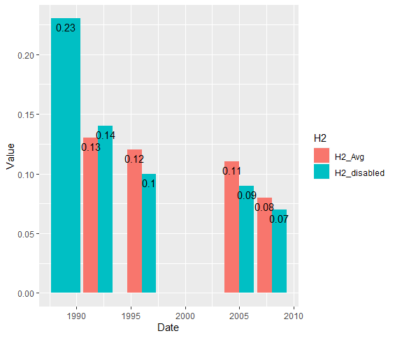
Dodged Barcharts - position text
There is somewhere an awesome SO answer explaining that the position_dodge depends on “data units” and its “resolution”. The latter can be querried with ggplot2::resolution(df$x). Its value needs to be multiplied by 0.9. I forgot why but the answer explained that. There are several SO answers with width=1. This works for resolution 1 and 1 * 0.9 ~ 1. If you look carefully, the text is not fully aligned in the middle position.
rq %>% ggplot(aes(Date, Value, fill = H2)) +
     geom_col(position = "dodge") +
     geom_text(aes(label = Value),
               position = position_dodge(width= resolution(rq$Date) * 0.9),
               vjust=1.5)
This gives
 back to top